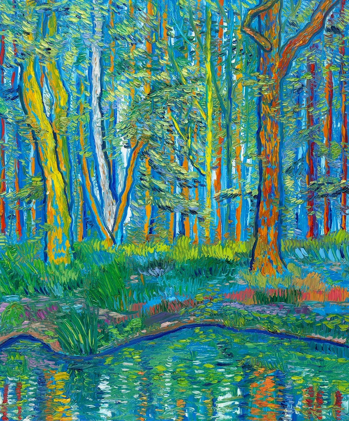
My goal in painting is to make something that feels fun, fresh and alive. My paintings should never feel like “work” when I’m making them. In order to have fun while painting, I rely on a few key compositional techniques that increase my chances of making an effective piece, because it’s no fun to make bad art.
Here are four things I consider each time I begin composing a landscape painting:
Gesture
When I plan a painting the first thing I look for is a compelling gesture. For me the gesture is the most important aspect of the image as it leads the eye and defines the main shapes of the composition. A gesture in a painting works in the same way that a plot works in a story. The gesture leads the viewer’s eye through the artwork, creating alternating sensations of tension and release.
Here are a few of my paintings alongside sketches that show the gestures in yellow, as well as the negative spaces in blue:
The gesture in this painting starts with a high level of tension as the tree rises from the dramatically lit earth, creating a sense of release as the branches thin out and give rise to the soft dark green leaves across the top of the painting.
The outside edges of the image have a sense of openness and then closes in as the lines from the path, horizon and trees all come crashing together into one single point. The tension is then released with the open sky and clouds.
This painting of Georgia O’Keeffe’s home and studio starts with a sense of tension because most of the view is blocked by a large wall in the foreground. A sense of release comes partially from the black window but mostly from the ladder which cuts vertically across the horizontal lines of the wall and gives an emotional sense of release by drawing the eye up the ladder and to the open sky.
Similar to the painting above, this image starts with a high level of tension by making the lake appear as if it were a wall in the immediate foreground. The simple, softer gesture of the clouds offers contrast to the flat depiction of the water. A dramatic sense of release comes from the simple gesture of the boat’s mast crossing the line of the horizon, connecting the ocean with the sky above.
Rule of Thirds
I frequently compose my paintings using the rule of thirds or occasionally the golden rectangle. The rule of thirds says that images look best when important parts of the composition are a third of the way from the top, bottom or side of the image. I often use this rule to determine where the horizon begins - either a third of the way up from the bottom or a third of the way down. The rule of thirds can be helpful to avoid creating stagnant compositions where exactly half the image is sky and half the image is the earth. The rule is of course just a guideline.
Color Schemes
Color wheel
Basing a painting on two complimentary colors (colors opposite each other on the color wheel) is a great way to create visual tension in a painting. Complimentary colors create both contrast and balance. Here are the three main options:
Orange & blue
Red & green
Purple & yellow
Of course most paintings require more than two colors so once I have covered my painting predominantly with my main two complimentary colors, I will then add another one or two additional pairs of complimentary colors to the painting to provide highlights and create further depth.
Here are some examples:
Primary color scheme: green mountains with red roofs. Secondary scheme: blue sky and orange clouds
Primary color scheme: blue background, orange trees. Secondary scheme: yellow trees and purple grass. Tertiary scheme: red trees and green grass
Primary scheme: blue sky and orange factory wall. Secondary scheme: green grass and red sign and red train tracks. Tertiary scheme: yellow windows and purple grass
Lighting
I’ve recently been focusing on adding interesting lighting in my works, but it’s not always easy to achieve. Lighting is the key to a great painting, you can have a good gesture and some skill, but without strong lighting the painting will usually lack feeling. Interesting lighting doesn’t have to be bright or extreme, it just has to be dramatic or visible to some degree. Here are some examples of paintings I made that show my attempt to include lighting as a key component to the work.
Although these techniques help me, I don’t believe there are hard and fast rules when it comes to painting. These are just some of the few techniques that help me feel more creative while painting.


